
Web stores that are well-organized, comprehensive and easy-to-navigate are absolutely essential when it comes to closing an important sale. But good web design isn’t just for B2C sellers anymore. More and more, B2B retailers are finding that an elegant and eye-catching design for their web store leads to more conversions. B2B website design is often the hidden ingredient in e-commerce success.
Why is good B2B website design so important?
The reason your customers shop with you all comes down to their experience with you as a supplier. You should aim for their experience to be seamless, convenient and rewarding.
In this way, offering your customers a great online experience is key. Although B2B e-commerce is often more traditional than B2C (business-to-customer) e-commerce, your B2B customer is still a consumer in their free time. They might order new gadgets on Amazon on Sunday and then go to your web store on Monday morning to order spare parts, coffee or other supplies. The experiences that they have in their private life set the bar for when they visit your e-commerce web store.
And if they have a poor user experience, they might decide not to purchase from your web store — or they might simply not be able to find what they are looking for!

Find out what your B2B customers want
Download our B2B Buyer Guide for independent research on the topic.
Getting started with making your web store top-class
As buyer expectations grow, it is highly important that your web store design keeps up with them. There are a few approaches that can be utilized to take your web store from just functional to fresh and inviting.
Keeping user experience and conversion top of mind, we have compiled a list of tips and B2B web design best practices to help you build stronger relationships with your customer base.
1. Optimize your photos and product images
Stretched out pictures, blurry images, huge image sizes or no/little product photos at all. We’ve seen it all. Make sure to use images on your content pages that are of good quality and not too heavy in terms of file size. This will increase the performance of your web store and your customers’ user experience.
So, I would advise you to do the following:
- Compress your images and find a balance between size and quality, especially with full-page banners. Adobe Photoshop, is, of course, the most professional design software, but that also comes at a high cost. There’s also software like Affinity Photo or Luminar that isn’t expensive and will work perfectly to compress your images.
- Invest time in taking photos of your products. Your customers are more likely to buy products if they can see what the product looks like. This applies even to customers who always order the same products. The better the picture, the more attractive the product. Conversion is influenced by many psychological factors, including a subconscious feeling of security. Your customers want to be sure that they are choosing the right item when they order your products.
2. Build dynamic page designs with a mix of content blocks
Content blocks are building blocks that you bring together to create your webpages. These can be image sliders, text blocks, and videos, but also newsletter and Twitter feed content blocks.
To create a great e-commerce customer experience on your website, you need to mix and match your content blocks. Pages that are mostly white and lack color and images can quickly become dull to customers. Creating a contrast helps your customers identify the different types of pages. It also makes your pages come alive, showcasing your products and company in a better light.
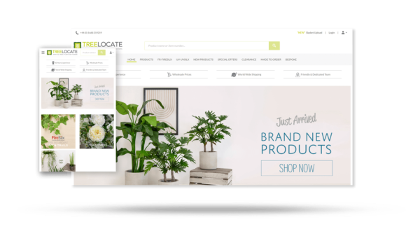
Our B2B customer TreeLocate has built a great website that provides its clients with an astounding e-commerce customer experience. They are experts in using full-page image sliders, product sets (like best-sellers) and services content bars (shipping, service, etc.). Note that their use of photos and product images also contributes to a stunning web store design.

TreeLocate’s web store design has improved customer experience.
3. Create a well-converting conversion path with the right color usage
You can use color to guide your customers towards the pages/paths that are important to your web store. It all starts by using contrast — a dark text and button on a dark image, or a light button on a light page won’t stand out. If a certain button or call-to-action is relatively unimportant, give those buttons a neutral color. If a button should lead to a conversion, make that button a color that stands out.
Do you want your products to convert well? Then you can influence your customers on their way to the checkout by making all the important buttons the same, eye-catching color. We call this a conversion path.
Your company probably has a style guide. When you pick a color palette for your e-commerce website design, try to pick the most eye-catching colors from your company style guide. If your style guide doesn’t have any eye-catching colors, you might want to consider expanding or adjusting your guide to contribute to your online conversion. Our customer K-Rain Manufacturing managed to develop a great e-commerce customer experience that matches their brand identity. Their conversion path stands out and has achieved great results.
4. Help your customers easily find your products
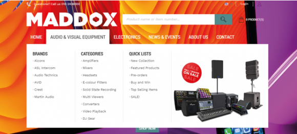
Is your e-commerce website’s main menu overflowing with categories, subcategories, brands and other information? Then it’s probably difficult for your customers to find the products or pages that they are looking for. How can you solve this problem? That’s easy: just keep it simple!
Here are some examples of how you can simplify your product catalog:
- If you have too many items in your main menu, think of ways to regroup them to make your main menu less crowded. Do you really need to mention 10 types of tires? Or is “tires” enough for your customers to understand that they need to click there to find the right tire?
- Leave out categories that are less important.
- Create a separate landing page or product carousel for seasonal promotions, trending items, etc. to make them stand out.
- If your assortment is simply too big and targets both B2B and B2C customers or products with a different purpose, consider setting up separate e-commerce websites. This will allow you to offer more relevant content to your customers.

Learn more about how to manage your e-commerce product catalog with our 8 best practices.
5. Ask your customers for feedback on your website design
All successful e-commerce websites have one thing in common: customers that love using it. Although we sometimes think that we know what our customers want and how they work, we probably don’t know everything. There’s only one way to find out: collect customer feedback. Ask questions like:
- How do you research for products?
- Why would or wouldn’t you use a web store or customer portal?
- Which features influence you to make online purchases?
When you’re a B2B company, you have the unique advantage of having a good relationship with your customers. So, send out a survey, give 10 customers a call or ask them to get together in a room for a feedback session. The outcomes will truly help optimize your e-commerce website design.
Find out more about how to capture B2B customer feedback to improve your e-commerce customer experience.

See how to use your web store for more
Read the blog on how to turn your web store into a self-service portal.
Utilizing an intuitive Visual Designer
Most of these tips can be accomplished easily through software that is built for making web stores more appealing and functional. In Sana Commerce’s flagship product, Sana Commerce Cloud, priority is given to providing good web design options for our B2B customers.
Chief among these options is our all-new Visual Designer. The Visual Designer allows you to easily arrange and style your web store without needing any in-depth knowledge of coding and front-end development. It includes drag-and-drop functionality so you can arrange all content blocks with ease and speed.
You can also style the background and accent visuals with customized images and video to provide a strong branding experience throughout the customer journey. You can personalize and connect customer segments so that each buyer who visits your web store has an experience that is tailor-made to their needs.
More e-commerce design and content tips
Optimizing your e-commerce website design will lead to happy and well-converting customers. Adding in images, content blocks and color doesn’t have to take too much of your time and can have a massive impact on your business. So, make sure to gather your customers’ feedback, grab your style guide and get to work.
Want to take your web store to the next level? Check out our additional resources for B2B and B2C web stores:
- Understand and optimize your customers’ online journey with our e-commerce user stories template and examples.
- Are you just starting an e-commerce project? Download our Ultimate Guide to E-Commerce to help you steer your project.
If you’re a Sana Commerce customer, feel free to reach out to your team for personal advice on your website design and how to become more successful with e-commerce.


